


 Database Development


")


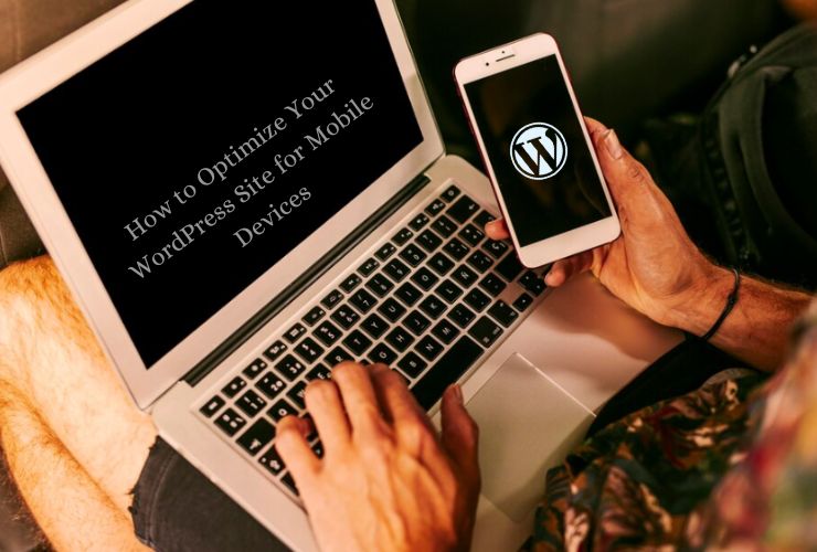
Today, it is important that your WordPress site be optimized for mobile devices. As most people use their smartphones and tablets to browse the internet, a mobile-friendly site boosts user experience and helps rank higher on search engines. Here is how you can easily make your WordPress site mobile-ready:
1. Select a Mobile-Responsive Theme
Choose a mobile-responsive theme. Themes automatically adapt to any screen size, so your site will look good on both phones and tablets and even desktops. Many modern WordPress themes are already mobile responsive, so you will mostly need to find one to suit your business.
2. Optimize Your Images
Big images are known to make your website load slowly, especially on mobile. Optimize images using image compression plugins like Smush or EWWW Image Optimizer, which compress images without affecting their quality. Another method is lazy loading, which ensures that images only load when they are about to be viewed. This helps speed up page loads.
3. Enable Caching
Caching is the key to having improved speed on your site. The static files will be stored there to make your pages load way faster without overloading your server. Plugins like WP Super Cache or W3 Total Cache can help activate your WordPress site’s caching.
4. Accelerate Your Site
Mobile users expect fast websites especially. Websites must load extremely fast. Tools like Google PageSpeed Insights or GTmetrix can be used to check up on your site’s performance. Declutter your server response time, minimize CSS/JS files, and turn on browser caching to make your site faster.
5. Navigation must be easy
Navigation is critical on mobile devices. Ensure that your website has a user-friendly, mobile-friendly navigation system. Reduce your menu and use sticky navigation bars or hamburger menus so that the user can easily find what he needs on small screens.
6. Optimize Your Content for Mobile
Make your content readable on smaller screens. Short paragraphs, larger fonts, and ample white space between lines make it easy to read. No pop-ups and ads must interfere with the mobile experience. Keep the content clean and simple so that it can be consumed easily on the go.
7. Make Forms Mobile-Friendly
Forms are the number one way to engage your visitors: for contact, subscriptions, or checkout. Make sure they are accessible to fill in on mobile. Use mobile-friendly form plugins and keep forms simple by offering fewer fields, making it easier for users to complete them on smaller screens.
8. Test on Multiple Devices
It’s essential to test how your site looks and works on different mobile devices. You can use tools such as BrowserStack or Responsinator to see how your site looks across different screen sizes and browsers. It’s also a good idea to manually test the site on several devices so that the user experience goes smoothly.
9. Use Accelerated Mobile Pages (AMP)
AMP is a framework that aims at making the web pages load faster on mobile. You can make your site faster for mobile users by adding AMP. With WordPress plugins such as AMP for WP, you can easily do this.
Optimizing your WordPress site for mobile is no longer optional—it’s a must for improving user engagement and SEO rankings. By choosing a responsive theme, optimizing images, speeding up your site, and making content and forms mobile-friendly, you can deliver a seamless experience for your visitors. Apply these tips to stay ahead and ensure your WordPress site performs well across all devices.
Contact Us Today