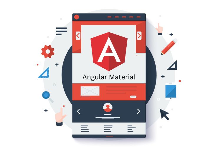
User experience and design consistency are essential in today’s web applications. Whether you’re building a dashboard, admin panel, or consumer-facing product, clean UI matters. Angular Material—the official UI component library for Angular—makes it easier to build modern, visually appealing, and responsive interfaces, all while following Google’s Material Design principles.
This blog walks you through the essentials of Angular Material, its benefits, and how you can use it to craft seamless and professional user interfaces in your Angular applications.
What is the point of utilizing Angular Material for user interface…?
Angular Material provides developers with a full set of UI components that are pre-built and customizable. It helps developers to:
- Maintain consistency visually throughout the application
- Make development faster with UI components/design elements that are ready to go
- Help improve accessibility, responsiveness
- Concentrate working on functionality rather than having to think about visual design
All components are fully responsive and optimized for mobile-first design ensuring you can meet modern-day design expectations effortlessly!
Benefits Overview
1. Consistency/Standardization
If you have a design system implemented, Angular Material makes sure spacing, typography and layout behaves the same across all components based on a design system like Material Design.
2. Ready-made components
You now have access to professional UI components like buttons, cards, forms, tables, modals, menus, navigation items, tabs etc., which people have already sweat and labored over far longer than you probably will just implement by your own.
3. Accessibility-ready
All components are talked about accessibility. Putting web apps into the hands of many and addressing accessibility as an afterthought is not only not very cool, it’s not legal in most instances (ADA compliant).
4. Responsive by default
Angular material components work across screen sizes from desktop (less than 80inches) to mobile (less than 6 inches).
5. Theming support
You can swap promises of colour with a single line or instantly swap from dark/light mode. You can have a theme which allows it to be branded as long as it is still usable.
Core Components To be Aware of
Angular Material provides a large set of components, many of which are constantly.
Some the most common componentes include:
- Navigation: toolbars, side navs, menus
- Layout: grid list , cards, expansion panels
- Forms: inputs, checkboxes, radio buttons, selects, date pickers
- Buttons and Indicators: buttons, toggles, progress indicators, spinners
- Data display: tables, lists, badges, chips
All of the components follow Material Design Guidelines, we can customize any components which use Angular directives and services.
Creating Clean Layouts Using Angular Material
A modern UI should not only look nice but also function properly and respond well. Use layout components from Angular Material to make layouts that support a nice flow for the user and are responsive to different screen sizes. It’s easy to create dashboards or multi-columns UI by using the Toolbar, Sidenav, and MatGridlist together.
Whatever you are creating, you will find the grid system a very helpful design tool, it helps arrange the content but also keeps it responsive. You can utilize as much flexibility as you want to easily change layout if you get user feedback, or if you need to change due to a design change.
Theming and Customization
Angular Material includes theming support right out of the box and makes customization a breeze. A few quick changes in the theme config can adjust colors, fonts, and density, all to align with your brand. You can:
- Choose and use pre-built themes (for example, Indigo-Pink or Deep Purple)
- To create custom themes using SCSS mixins
- Add light and dark mode support, almost effortlessly
- This provides visual uniformity while allowing your brand’s character to come through.
Performance and Productivity
Angular Material improves developer productivity when building UI. Developers can add pre-tested components instead of designing each one themselves, which saves on bugs and inconsistencies.
More rapidly than implementations alone, this leads to better apps with fast initial load times, responsive defaults, and accessibility added by default.
When to Use Angular Material
Angular Material is great for:
- Internal dashboards and administrative panels
- Enterprise applications
- Customer portals
- Anything that is an E-commerce back office
- Learning management systems
- Educational platforms
When consistency, scalability and speed are required Angular Material is a win.
Best Practices When Working with Angular Material
- Load Only the Components You Need to Keep Performance High!
- Use Angular Material and Angular Flex Layout together to help create responsive and fluid layouts.
- Use the same theme for all components in your application.
- Customize components only when needed so you don’t break accessibility and performance.
- Test your components on different devices and screen sizes to ensure your application is responsive.
Conclusion
Creating clean, modern user interfaces in Angular can be quick and easy. Angular Material helps developers build for the modern web by providing a set of components that align with the web standards we currently use. As a suite of components for navigation and layouts, theming and accessibility, Angular Material has everything you need to build a high-quality user experience.
Using Angular Material in your projects helps you to save development effort, keep cohesive designs across applications, and improve quality for the user experience—without sacrificing flexibility or scalability.
Contact Us Today




 Database Development


