


 Database Development


")


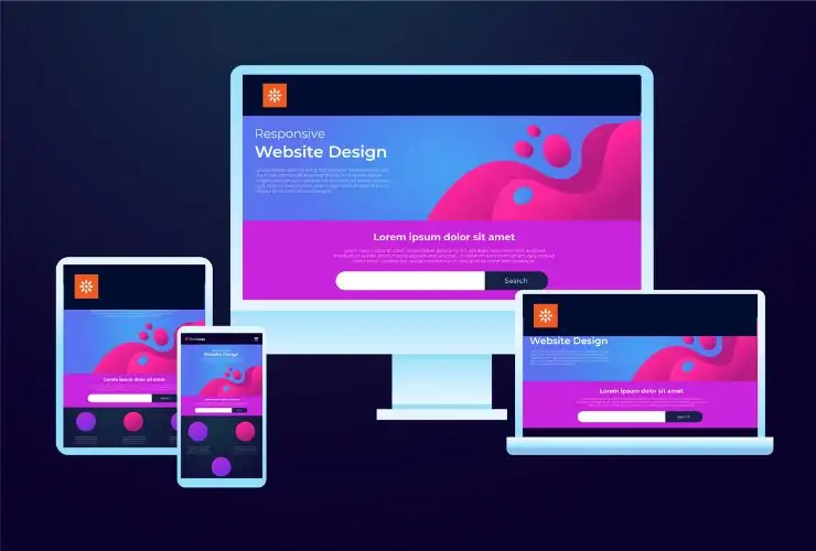
In the present world’s bias towards mobile devices, making sure your website looks impeccable and works seamlessly over all devices is critical. For businesses utilizing Kentico CMS to produce mobile-friendly templates in experience that captivates and hold visits, no matter the size of the screen.
Not only will a responsive Kentico design enhance usability, it will also enhance SEO and improve conversion.
1. The Importance of Mobile-Friendly Design
More than half of all web traffic is generated from mobile devices. If a website cannot adapt to smaller screens, users are most likely to bounce. Kentico’s flexibility allows developers to create templates that adapt layouts, images, and navigation based on the screen size.
Responsive templates ensure quicker load time, better readability, and a consistent experience— a crucial factor for better engagement and conversions.
2. Incorporate Responsive Frameworks and Grids
When starting a template design, use a responsive front-end framework like Bootstrap or Tailwind CSS. These frameworks have built-in grids (and components) that can automatically scale items based on device width.
In Kentico, you can incorporate these frameworks directly into your page templates or layout sections ensuring you have a consistent design system across all pages and devices.
3. Optimize Images and Media
Large images can slow down your site—especially on a mobile device. By using Kentico’s image variants or Media Library, you can provide optimized image versions based on screen size.
You also want to turn on lazy loading for images and video, which will further improve your site performance and reduce bandwidth. With lazy loading, mobile users will have quick load times, while not compromising image quality (as images won’t load until they are visible).
4. Simplify Navigation for Mobile Users
Usability is pivotal with mobile users, especially with navigation. Get rid of complex menus and replace them with collapsible navigation (also known as a hamburger menu) or slide-out panels.
You can have Kentico’s page builder widgets and menu components changed to reflect a simplified menu or icons for the smaller devices, providing a better way for users to find what they want faster.
5. Use Kentico’s Responsive Capabilities
Kentico provides several built-in helpful tools that assist with mobile responsiveness – such as:
1. Device Profiles: Kentico can detect and change the content or layout based on what type of device users have.
2. Media Queries: Kentico can use CSS rules defined in your stylesheets to apply the rules to specific screen sizes.
3. Widget Zones: Kentico has provided many useful widget zones or areas to place multiple pieces of content for different layouts. You can simply change the widget to the needed zone.
Combining these features, you can adjust how your site is responding on many devices without duplicating a template.
6. Testing Across Devices and Browsers
Even with responsive frameworks, it is important to thoroughly test your site. You might use the Kentico preview mode, or go online to use something like BrowserStack or Google Mobile-Friendly Test to see how your templates look on different devices.
Testing regularly means your site looks sharp, and works well, whether on smartphone, tablet, or desktop.
7. Focus on Performance
Performance affects user experience and SEO rankings. Optimize your CSS and JavaScript files, take advantage of browser caching, and leverage Kentico output caching to reduce load times.
A quicker site improves user experience because it is less frustrating for your audience, as well as communicates quality to search engines, which supports better visibility.
Conclusion
Building mobile-friendly Kentico templates is not simply about adjusting content to small screens, but about building for flexibility, usability, and performance. If you take advantage of Kentico responsive features, optimize media, and test thoroughly, you can fulfill the aim of a site that looks amazing and works well on any device.
Intentionally constructed responsive Kentico sites will enhance user engagement, improve SEO visibility, and prepare your business for performance in the growing mobile landscape.
Contact Us Today